Case Study Summary: Redesign of Broker Portal
UI/UX Designer
Project Lead
Business Need:
United HealthCare One, part of United HeathCare, sought to redesign its website to improve user experience, enhance brand image, add new functionalities, reflect a rebranding effort that was more inline with United HealthCare with the hope of achieving increased traffic and improved conversion rates. The existing user interface was outdated and limited in functionality which hindered users from fully utilizing the product's features.
Design Process:
1. Discovery & Ideation:
The project started with a comprehensive discovery phase, where we analyzed the business objectives, reviewed new design concepts for the direct-to-customer flow, and aligned them to create a seamless, cohesive website. I collaborated closely with the development team to fully understand the requirements for the Broker Portal, becoming the subject matter expert (SME) for the Broker redesign effort. This phase also involved creating journey maps to ensure our design decisions were based around genuine user needs.
2. Initial Designs & Prototyping:
Based on the insights gathered from research, I began iterating on existing direct-to-customer designs and prototypes for critical flows. The focus was on simplifying the user experience by reducing unnecessary steps and clarifying the information architecture. I used Figma to iterate on these designs and create interactive prototypes for stakeholder collaboration. No usability testing was requested.
3. High-Fidelity Design & Handoff:
Once I had integrated feedback from key stakeholders, I proceeded to solidify the high-fidelity designs. To ensure smooth collaboration, we held weekly handover meetings where I shared the latest designs with the development team and presented updates to stakeholders. If any actionable feedback was received, the designs were iterated upon and reintroduced during the following week's handover session.
4. Post-Launch Evaluation:
After the product was launched, I collaborated with the broker sales team to monitor user behavior and gather feedback on the new design. This helped identify any remaining pain points and areas for future iteration.
Outcome:
The redesigned website resulted in increased user engagement and higher conversion rates. Brokers were able to move faster through the website, which was of utmost importance to them. The success of this project demonstrated the importance of aligning user needs with business objectives through thoughtful, design.

Old Broker Census Page
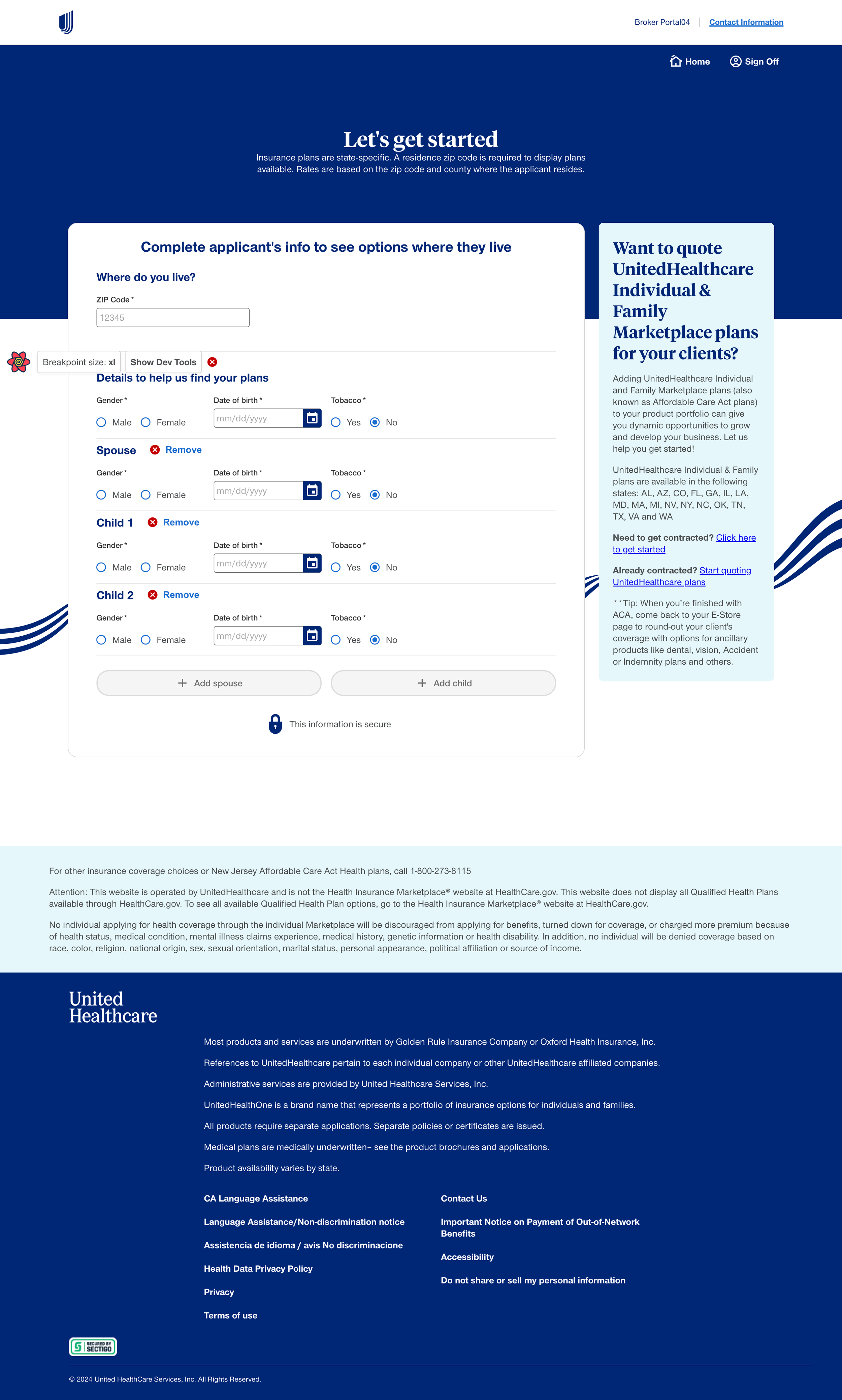
New Broker Census Page

Old Broker Plan Overview Page
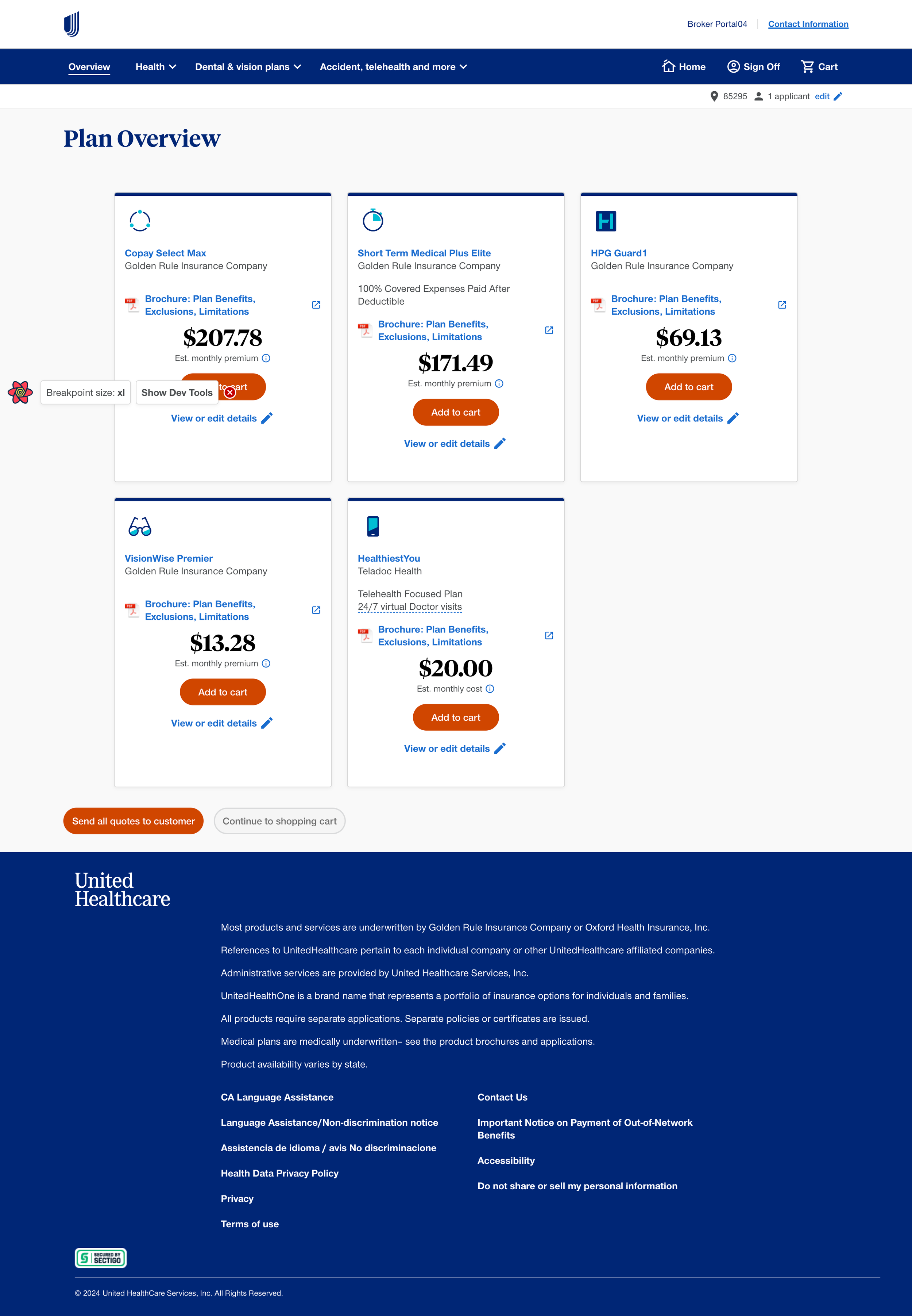
New Broker Plan Overview Page